Stamps: Uniko - Originally Organic Additions, Simply Said Blocks II, Organic Wishes
Inks: Gina K - Passionate Pink, Jelly Bean Green; SU - Pool Party
Dies: Uniko - Originally Organic Additions Dies
Accessories: Gina K Card - Black Onyx; White Lustre Card; Shimmer Spritz - Frost; Circle Punches
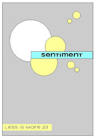
I used the sketch from the current Less is More - LIM#370 for the layout and the colours are from Global Design Project - GDP#137. I started by spraying some white card with frost shimmer spritz. Once dry, I stamped the images and used the matching dies to cut out the vine frame and flowers, I used punches for the circles. I made the base from black card so that the stamped and die cut images really pop. I attached the vine frame and circles flat to the card and used dimensional pads to add the little flowers and the sentiment. Ont he inside, I simply cut a panel of white card on to which I stamped a greeting and another flower.
For more inspiration from the rest of the Design Team, and our Guest Designer, Anna, do visit Bev's blog.
Sorry, this is so late - I was so convinced that I'd written this post! Hey ho! See you again tomorrow for the last of our introduction posts. Bye for now!!


12 comments:
Lovely combination!
Oh you’ve been so clever adding in those extra whispy Organic Wishes stamps. And so striking against the dark card stock!
This is lovely, Deborah. Those colours look so pretty on the black background, and a really creative use of the sketch.
Thanks so much for sharing with us at Less is More, Anita x
Oh, those colours...that layout...absolutely pretty x lovely!
Hugs~carol
Pretty on the outside and inside. I like the dark background on the outside.
The colours really pop against the dark background! Fab use of the inspiration sketch x.
The pink flowers certainly look good against the black background. :)
How striking! Another gorgeous combination of challenges and I’m glad that LIM challenge is part of it. A fabulous take on the challenge and a great showcase! Thanks so much for sharing and for playing along at Less is More.
An inventive take on the sketch, these are such pretty stamps! Your colors really pop from the dark base. Thanks for joining us at Less Is More!
Wow !! You’ve made a magnificent card !! I love the dark background.
[margessw(at)icloud(dot)com]
Those pretty flowers look fab on the black cardstock ..... great design xx
Thought I'd commented on these designer dies too but obviously not! Another fab idea and so eye-catching against the black cardstock. Thanks for joining us at Less is More too. x
Post a Comment