Showing posts with label Tim Holtz Distress Inks. Show all posts

Thursday, 7 May 2015

Great Lakes Mega Meet ....

...  It's been a really fun day here in Northville.  Today is the first day of the Great Lake Mega Meet in Novi and I was out early as those of us who pre-register can get in at 9.00am.  I think that a lot more people registered early this year as there was quite a crowd waiting for the gates to open!!

I had several things that I wanted to get today - the new Distress pads in both colours, some more Copic markers and the new Hero Arts ombre pads.  I was really pleased as I manged most of that - sadly only managed to get the Fossilised Amber though.  Here's a photo of my haul:


I'm delighted with my new goodies.  Here are close ups of the various items:


Love these crazy bird stamps.  A few Christmas stamps from Dylusions and then these wonderful sets by Brett Weldele - love the zombie!!


There was a special on this stand - buy three Lawn Fawn items and get the fourth free - well, it was a bargain!!


I found the Hero Art ombre inks - I think they're fab.  The bottles are Color Burst from Ken Oliver Crafts.  They contain mircofine highly pigmented water colour pigments for watercolour backgrounds.  They are bright and easy to use.  Check out this video here.


I got some super new Spellbinder dies - basic shapes and some really fun geometric designs.


And finally - the lovely Fosillised Amber and the Grey Slate Dylusions spray. 

I didn't both to take a photo of the Copic markers - they are already in use!!  I bought a copy of Sandy Allnock's wonderful Hex Chart at the weekend and I spent yesterday morning colouring in the hexagons that I have.  I added the ones I bought today and you can see that I've still got quite a few to get!! 


If you haven't got this chart yet, it is well worth getting.  You really can see the way the colours relate to each, and you can also see the ones that are very similar!  Anyway, that's all for now.  It's time for me to get dinner sorted out.  See you tomorrow!

signature

Saturday, 15 February 2014

52CCT - Theme ....

.... Good morning everyone.  We had so many lovely cards for our colour challenge last week, and this week at 52 {Christmas} Card Throwdown we have a theme challenge.  Jacqueline has picked the theme of Christmas Landscapes, so much scope!  Here's my card:

Let it Snow - photo by Deborah Frings - Deborah's Gems

Stamps: Waltzingmouse - Alpine Christmas
Inks: Stampin' Up! - Island Indigo, Elegant Eggplant, Basic Black; Distress - Milled Lavender; Memento - Teal Zeal; Versamark
Dies: WMS - Alpine Christmas
Accessories: White Lustre Card; SU Card - Island Indigo, Elegant Eggplant; White Embossing Powder; Glitter


When I saw this theme I knew I had to use the wonderful Alpine Christmas (I think the alpine skiing might have had a bit of influence too).  I owe inspiration to a couple of cards - Laurie's and Kelly's cards.  I've used the colours from the current Waltzingmouse Fanatics Challenge - WMSFC#11 - I just love them!  You have until Thursday 20th February, 5.00pm to join the Waltzingmouse Fanatics challenge!

I made the card from Island Indigo, cut a panel of Elegant Eggplant on which I stamped the sentiment and snowflakes in Versamark and heat embossed them with white powder.  I cut a panel of white card slightly smaller then the purple and stamped the mountain range.  To make the really dark teal colour I inked up the mountains in black, stamped off once and then inked again with Teal Zeal - result a nice dark teal.  I stamped the alpine village using purple for the houses, soft purple for the snow covered roofs and light teal (Island Indigo stamped off once) for the trees.  I used the matching die to cut out the mountain and then attached it to the card to reveal the sentiment and snowflakes.  I finished the front by adding glitter.  For the inside I cut a white panel, added a bit of a village and a lovely Christmas verse.

Let it Snow inside - photo by Deborah Frings - Deborah's Gems

For more inspiration with the Christmas Landscape theme - check out the cards from the rest of the team - as always, they are just fab!  Looking forward to seeing your creations. 

My plans for the weekend include a mix of watching the Winter Olympics and some crafting.  Kathryn has a friend coming for a sleepover, so I won't see them for most of the time and Jonathan is off to a photo shoot.  It's going to be a fun time.  Hope you have a good weekend, be safe!

signature

Wednesday, 12 February 2014

Collage with stencils .....

... Good morning.  No card to share this morning, just a few of the collages that I made on Sunday.  I went to a craft class held at Stampeddler (my local craft shop) and run by Valerie Brincheck.  I always enjoy Valerie's classes - we get very inky and have lots of fun.

The class description was a "couple of hours experimenting with rubber stamp ink, paints, pastels, and mica sprays to create layered collage backgrounds for journals, card or scrapbook pages".  We were a mixed bunch of seasoned crafters and some newbies, but we all had a ball.

Unique - photo by Deborah Frings - Deborah's Gems

This is the first one I made.  I used a mixture of Distress pads, markers, stains, and various other ink pads.  I picked three colours - Salty Ocean, Mowed Lawn and Seedless Preserves - wiped them onto my craft sheet, spritzed with water and smooched the watercolour paper into the inks.  Then I simply added layers of texture with stencils.  I made sure to include text, organic and geometric patterns.

Art is - photo by Deborah Frings - Deborah's Gems

This was number two - almost exactly the same background colours, just changed out the purple for Mustard Seed.

Funky, freaky - photo by Deborah Frings - Deborah's Gems

This was the last one I made.  I was determined to go for colours that I didn't normally use, I had planned on yellows and oranges, but ended up with Barn Door, Seedless Preserves and Picked Raspberry.  I didn't manage to complete this at the class (it was only two hours and we really could have spent the whole afternoon there).  I completed it at home by adding the leaves, the silver flowers (with which I wasn't entirely happy) and the black stars.

These pieces all measure 8" × 6", a bit too big for a card and I don't really want to cut them down, so I think I'm going to put them in frames and have them on my craft room wall.

Today I'm off to a Stampin' Up! class at Karin's which will be just as much fun, but perhaps, not quite as messy!  I'll post pictures of what we make later.  Bye for now!

signature

Thursday, 6 February 2014

Sympathy in blue ....

.... Good morning!  We all need sympathy cards in our stash and I find it is always much easier to make them before you actually need them.  Here's my card:

With Sympathy - photo by Deborah Frings - Deborah's Gems

Stamps: CAS-ual Friday Stamps - Loving Thoughts; PTI - Think Big Favourites #3
Inks: Distress - Faded Jeans, Stormy Sky, Broken China, Tumbled Glass, Chipped Sapphire, Salty Ocean; Stampin' Up! - Midnight Muse; Versamark
Accessories: White Lustre Card; Silver Embossing Powder; SU Card - Midnight Muse

This card owes just about everything to my Design Team buddy, Nonni.  When I saw her card for our Addicted to Stamps and More! challenge I knew I had to CASE it.  I love the colour blocks and embossed flowers.  I changed it up on my card by using shades of blue, a different flower and silver embossing powder.  To make the base I masked off areas and sponged on the blue inks.  Then I randomly stamped the flower and heat embossed with silver powder.  I finished the front with a panel of white card and the sentiment stamped in blue.  On the inside I cut a mat layer in navy card and simply stamped a single flower.

With Sympathy inside - photo by Deborah Frings - Deborah's Gems

Michele, over at CAS-ual Friday Stamps - CFS#1 is having a challenge with the theme being "BLUE", and you must use at least one CFS stamp or sentiment.  I have most of Michele's stamps and had to play along.  I got the theme from the current challenge at MUSE - MUSE#53, where Vicki Dutcher is the Muse with a lovely sympathy card.


The thumbnail display at CAS-ual Friday stamps is absolutely lovely and I'm so pleased I got to play along.  Nonni, thanks again for the inspiration.  See you soon.

signature

Tuesday, 4 February 2014

Colour my world .....

.... Hi!  I've had a busy morning doing household stuff, but after lunch I managed to get a bit of time in my craft room and I've made a simple card for a couple of challenges:

You Colour my World - photo by Deborah Frings - Deborah's Gems

Stamps: Stamps of Life - Crayons2stamp, Words4crayons; CAS-ual Friday Stamps - Loving Thoughts, Butterbows
Inks: Stampin' Up! - Real Red, Pumpkin Pie, Daffodil Delight, Pacific Point; Distress - Mowed Lawn, Seedless Preserves; Versafine - Onyx Black
Accessories: White Lustre Card


The challenge at Less is More - LIM#157 is a colour challenge and they picked rainbow colours - well, how could I resist?  And they celebrate their 3rd Anniversary this week too!  The cue word at Addicted to CAS is "LOVE", and I think this sentiment conveys that message well.  I stamped the little crayon in rainbow colours, cut them out and adhered them to the card.  I stamped the drawn line directly onto the card.  Finishing the front with the sentiment at the top.  On the inside I stamped a butterfly rainbow and a simple sentiment. 

You Colour My World! inside - photo by Deborah Frings - Deborah's Gems

I made this card for Kathryn - she is such a happy girl and she really does colour our world with love, laughter and joy!  She came home with her school report yesterday, she was so pleased - straight As!  We're so proud of her.

signature

Saturday, 11 January 2014

52CCT - Colours .....

.... Morning all!  It was lovely to see so many fabulous cards for our sketch challenge last week; it's going to be very difficult to pick a winner.  Now it's time for our colour challenge at 52 {Christmas} Card Throwdown and Mynnette has picked gorgeous colours.  Here's my take:

Merry Christmas - photo by Deborah Frings - Deborah's Gems

Stamps: Stampin' Up! - A Banner Christmas, Sassy Salutations, Warmth and Wonder
Inks: Versafine - Onyx Black; Distress - Squeezed Lemonade; SU - Elegant Eggplant
Accessories: SU Card - Wild Wisteria, Bermuda Bay; White Lustre Card; SU Punches - 1¼" and 1/8" Circles; Papertrey Ink - Linen & Canvas Impression Plate; SU Marker - Bermuda Bay

I love the colours Mynn picked (you must use at least three) and my original thought was snowflakes (surrounded by quite a lot here), but I decided to go for a clean, graphic look.  I used the layout from Clean & Simple Stamping - FTL274 and am also submitting the card to the current Jingle Belles - JB:14:01 to use something old and something new on your card.


I was going to try and get all five colours on the front of the card, but ended up with three; I managed to add another colour on the inside!  I made the card base from Wild Wisteria.  All the yellow card I have is very gold, but I felt that the yellow should be a bit more acid, so I made my own.  I cut a panel of white card and sponged it all over with Squeezed Lemonade - it works perfectly.  I cut some Bermuda Bay card, embossed it with a linen texture (which you can just about see in the photo) and punched out some circles.  I stamped the graphic image three times on white card, punched them out and attached them to the card with dimensional tape.  On the inside I cut a panel of white card, stamped a simple tree and sentiment and finished off with a simple hand drawn border.

Merry Christmas inside - photo by Deborah Frings - Deborah's Gems

We have a super selection of inspiration cards to share with you over at 52 {Christmas} Card Throwdown.  I'm looking forward to seeing your creations with our non-traditional colours!  See you soon.

signature

Tuesday, 10 December 2013

ASM - Photo inspiration ....

... Good evening all!  This week our challenge at Addicted to Stamps and More! is a Photo Inspiration.  Our sponsor this week is Sami Stamps and the winner of the challenge will receive a $12 gift voucher to her store!  Here's my take:

Birthday Girl - Photo by Deborah Frings - Deborah's Gems

Stamps: Sami Stamps Digi - Zombie Beauty; Christmas Lights (don't know who made them); Stampin' Up! - Gorgeous Grunge, Sassy Salutations
Inks: Distress - Antique Linen, Peeled Paint, Wild Honey; SU - Real Red
Dies: Spellbinders - Mega Ovals Lg (S5-023) #4, Mega Oval Scalloped Lg (S5-024) #4; Die-namics - High Rise Numbers
Accessories: White Lustre Card; Gold Foil Card; Copics


So you're trying to figure out how I got this card from the inspiration photo!  I took the colours and the Christmas lights.  I saw this digi image - a tall, young lady - so pretty (albeit a zombie) and decided to make a birthday card.    I used the gold in the mat layers. I created a bokeh effect background paper on my computer by blurring a photo of Christmas lights and ornaments and then adding a subtle repeating text.  I stamped a row of Christmas lights at the top which I coloured with Copics and then adhere it to the gold mat.  I printed off the digi image and cut out one using the oval die and while still in the die I added some colour to create depth.  I coloured one of the other images and then very, very carefully cut it out and adhered it to the card.  I finished the front with a simple number!  For the inside (which I forgot to photograph) I used the grunge image and a bold funky birthday greeting in red.

Hopefully this card will have reached my niece by now - I can't believe she's 13 - they grow up so fast!!!


Don't forget to check out the inspiration cards from the rest of the team - we all took something very different from the inspiration photo!  Bye for now.

signature

Saturday, 23 November 2013

52CCT - Acrylic block background ....

.... Morning everyone, it's time for our technique challenge at 52 {Christmas} Card ThrowdownLouise wants us to create a background using the acrylic block technique.  By that, she means inking acrylic blocks, spritzing with water and stamping on to card - hey presto a quick and easy background.  I've included a link at the bottom of this post to a tutorial that I found on U-tube (there are lots more).  Here are my cards - yes, I got carried away and made a couple of cards:

Xmas Constellation - Photo by Deborah Frings - Deborah's Gems
Card Size: 4¼" × 5½"
Merry Christmas Constellation - Photo by Deborah Frings - Deborah's Gems
Card Size: 4½" × 6¼"
Stamps: Penny Black - Xmas Constellation; Stampin' Up! - More Merry Messages, Dictionary
Inks: Distress - Forest Moss, Pine Needles, Shabby Shutters, Peeled Paint, Evergreen Bough, Mowed Lawn; Stampin' Up! - Garden Green, Wild Wasabi, Coastal Cabana, Pistachio Pudding; Versafine - Onyx Black
Dies: Spellbinders - A2 Matting Basics A (S5-131) #5, A2 Matting Basics B (S5-132) #5, Wonky Rectangles (S4-306) #6
Accessories: White Lustre Card; Clear Embossing Powder; Black Card; Sakura Micron Pen; Kanban Sentiment Strip; My Favourite Things - MPD Graduated Diamonds Stencil; Signo White Gel Pen

I had lots of fun with this technique and ended up getting quite inky!  But that was half the fun.  I used several different sized acrylic blocks - long and thin, tiny squares, and a couple of different sized rectangles.  I inked the backs, spritzed and stamped.  I overlapped some of the stamped images dried them with a heat gun and then added more.  The top card has a somewhat smoother finish to the stamped blocks because I added more water to the acrylic blocks; the bottom card has a slightly blotchy look because of less water.  On the top card, if you look closely, you might just see a subtle patten of graduated diamonds.  I achieved this effect by spritzing water through a stencil and allowing it to react with the stamped blocks.  I didn't add any texture to the background on the bottom card.  I stamped the Christmas tree on each background and heat embossed with clear powder.

On the first card I used the Matting Basics to cut a rectangular image which I matted onto black card.  I stamped the Dictionary background on the card base and then adhered the Christmas tree.  It has the look of a painted canvas.

On the larger card I decided to have a bit of fun with placement of the image.  For this card I die cut the tree using the Wonky Rectangles and, after stamping the dictionary background, adhered the image directly to the card.  I put the die over the top of the image and lightly drew round the die.  Then, using a Micron pen I created a "Zentangle" type frame.  I finished the front of this card with a greeting that I found in my scrap stash - just happened to be the right colour!

For the inside of each card I cut a mat layer in black and on the white panel stamped the Christmas tree and added a sentiment.

Xmas Constellation inside - Photo by Deborah Frings - Deborah's Gems
Inside of top card
Merry Christmas Constellation inside - Photo by Deborah Frings - Deborah's Gems
Inside of bottom card
I think this is only the second time I've tried this technique - it was lots of fun and I'll certainly use it again.  Don't forget to check out the inspiration cards from the rest of the team.  I'm looking forward to seeing what you make with this technique.  See you soon.


Tuesday, 19 November 2013

ASM - Make your mark ....

... Good evening everyone - it's time for our Make Your Mark challenge at Addicted to Stamps and More!  Just a quick reminder about our rules for the challenge - your entry MUST contain the use of Markers - Stampin' Write, Copics, Promarkers, Flexmarkers etc etc and you can link up to a maximum of 10 challenges which includes ours!  This is my card using markers:

365 Day Trip - Photo by Deborah Frings - Deborah's Gems

Stamps: Papertrey Ink - Harvest Berries, Stylish Sentiments - Birthdays
Inks: Distress - Chipped Sapphire, Weathered Wood
Dies: Spellbinders - Labels 30 (S5-157) #3; PTI - Harvest Berries
Accessories: White Lustre Card; Distress Markers - Stormy Sky, Weathered Wood; Stampin' Up! Card - Smoky Slate, Midnight Muse; SU Ribbon - Midnight Muse

I used my Distress markers to stamp the pretty Harvest Berry leaves.  I coloured directly on the the stamps with the markers, spritzed some water into the air and passed my stamp through the water droplets and then stamped the image.  This technique gives a light, even coverage of water and allows the markers to blend as you stamp.  The smaller images were stamped on to die cuts - these images are solid and you can see the blending a little better on them.  I made the sentiment label by stamping onto white card using a die to cut it out and made another die in light grey card.  I cut the grey die cut in half and attached to the sentiment slightly offset to give a border.  I added the ribbon to the card and adhered the sentiment label over the top using dimensional tape.  Inside I cut a mat layer in navy and on the white panel stamped some more leaves, with a space for my message.

365 Day Trip inside - Photo by Deborah Frings - Deborah's Gems

I used a couple of challenges to make this card - I used the layout from CAS(E) this Sketch! - CTS54 and the theme of a clean, simple leaf card is from this week's The Paper Players Challenge - PP172


Don't forget to check out the inspiration cards from the rest of the design team - as always they are just fab.  Before I go - thanks to everyone who played along last week with our Anything Goes challenge - we had a record number of submissions and that makes it really hard to pick a winner!!  See you soon.

Friday, 18 October 2013

It's PJ Party time .....

..... Hi!!  It's time for the Waltzingmouse Pajama Party and this party has a bit of a Halloween theme.  Claire wants us to make Halloween cards with a (1) Green colour theme and (2) a Victorian theme, and she also wants us to play with Art Deco in black, white and a pop of colour.  Well, how could I resist?

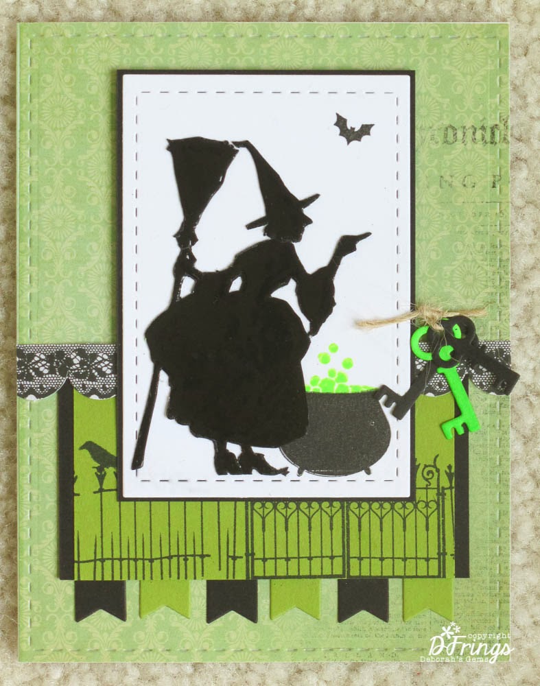
Here's my Green themed Halloween card:


Stamps: WMS - Gracie at Halloween, Hocus Pocus, Midnight Feast, Halloween Party
Inks: Versafine - Onyx Black; Hero Arts - Neon Green; Versamark
Dies: Lil Inkers - Stiched Rectangles #3 & 6; Die-Namics - Fishtail Flags Layers Stax, Locks and Keys
Accessories:  Kaisercraft DP - Pickled Pear; Stampin' Up! Card - Lucky Limeade, Basic Black; Black Embossing Powder; Twine; White Lustre Card


I used the layout from this week's Mojo Monday - MOJO315.  I covered the base card with green paper which, if you look closely, has a subtle pattern and some printing too.  I then embossed the stitched detail.  I cut the green panel and layered it onto some black card, and added a fence and raven too.  I die cut the flags from scrap card.  I added a border of scalloped black lace.  I stamped the witch onto scrap card and embossed, repeatedly, with black powder resulting in a really glossy image which I then cut out.  I cut out the white panel and stamped the cauldron and bat before adding the witch.  I adhered the panel to some black card and attached it to the card with dimensional tape.  I finished the front with a bunch of keys and twine.  The inside has a mat of green card and on the white I stamped the fun poem and lots of witches flying by!!


My next card is based on the current Ribbon Reel challenge - RR64 to make an Eerie Elegant card with black, purple and a ribbon.  Claire's requirement is that it has a Victorian/Ghostly feel.

  
Stamps: WMS -  Hocus Pocus,The Count, Christmas Opera Tags, All Hallows Eve
Inks: Versafine - Onyx Black; Stazon - Jet Black; Distress - Seedless Preserves; Stampin' Up! - Elegant Eggplant
Dies: Spellbinders/WMS - Opera Tags
Accessories:  SU Card - Elegant Eggplant; White Lustre Card; Black Ribbon; Gems


I stamped the spooky tree in Elegant Eggplant directly onto the card base.  I stamped The Count in Stazon to ensure that the image was as black as possible and then I fussy cut him out.  I stamped the large Christmas Opera tag in purple, die cut it out and added the Halloween medallion in the centre.  I punched a hole at the top of the tag and added some ribbon.  I attached the tag directly to the card base.  I adhered the Count with dimensional tape - giving the appearance of him walking out of the tag.  I added a few purple gems to the image.  I finished the front with a very simple sentiment.  On the inside I cut a mat layer in purple and on the white panel I stamped the Count's very simple request!!


My final card for the PJ Party which features Art Deco images, is a birthday card and I've used this week's layout from Freshly Made Sketches - FMS108


Stamps: WMS -  Big Day - Today, Art Deco Background, Putting on the Ritz
Inks: Versafine - Onyx Black; Hero Arts - Neon Pink
Dies: Spellbinders - Rectangles Lg (S4-132) # 4 & 5
Accessories:  SU Card - Basic Black; White Lustre Card; Ribbon


This is the first time I've played with these stamps - they are so, so elegant!  I stamped the large Art Deco background directly onto the card base.  I due cut the black rectangle and adhered it directly to the card, then I added the black horizontal panel and ribbon.  On some white card I stamped the deco frame in neon pink - which really pops against the black and white - and cut it out with a die.  I stamped this fun sentiment in the centre - after all birthdays are a time to drink champagne and dance!!!  I finished the front with a couple of jewel style tags.  I kept the inside ultra clean and simple, with a black mat layer and on the white panel I stamped an elegant birthday wish and some pink corner decals!


I've had lots of fun making these cards.  I think that's all my Halloween cards finished now - most will be posted back to the UK; I know it's not really celebrated there much, but it is here!!  Now, I'm going to sit back and have a look at everyone else's PJ Party cards.

Before I go, this seems a good opportunity to remind all you Waltzingmouse Fans that we have a new challenge at Waltzingmouse Fanatics starting tomorrow - please do drop by and play along!  See you soon.

Related Posts Plugin for WordPress, Blogger...