Sunday, 21 August 2011

CR84FN36 - Sunflower shines ....

... we're on week two of the current CR84FN challenge - CR84FN36 with our lovely sunny colours of yellow, kraft and a neutral.


I've been having fun playing with bows - thanks to a wonderful tutorial by Becca - and I've got one on this card - it worked a treat.  I started off by making my own gingham backing - a perfect match to the sunflower.  I stamped the sunflower three times - using two of the images to make layers.  The images were all coloured with Promarkers.  I cut the base image out using my trusty nesties and also made a mat from the coordinating scalloped set.  Before attaching the image, I tied on some raffia ribbon and did the bow!  So proud of that bow!  You might be seeing few more bows now that I can do them :)  Finally, I added a sweet flower shaped sentiment which I think goes with the flower perfectly!


Stamps: Hampton Art - Willowy Sunflower
Inks: Stampin' Up! - Daffodil Delight, Early Espresso; Versamark
Promarkers: Gold, Lemon, Canary, Lime Zest, Moss, Pastel Beige, Warm Grey 1
Spellbinders: Standard Rectangles Sm (S4-130) #5, Scalloped Rectangles Sm (S4-131) #5
Accessories:  Card, raffia ribbon, Craftwork cards sentiment from stash

These colours are proving to be really popular and we have lots of lovely cards already entered, but there's still plenty of time to join in.  I hope this has given you some more inspiration.  Do check out the blog for more cards from the team and for full details of the challenge. 

That's all for today.  See you soon.

Saturday, 20 August 2011

Play Date Cafe ....

... I was delighted with the colours for this week's Play Date Cafe Challenge - PDCC95 - navy, bubblegum and leaf green. 


My card has a clean and simple design.  I started with the flower stamp - not fussy, not frilly - just stylised flowers and leaves.  I stamped it in navy and embossed with clear powder.  I coloured the image with my aqua pen and stamping inks.  I found the matching card from my stash and cut out several layers using my nesties.  Finally, I added a simple sentiment. 


Stamps: Kanban - All Occasions set
Inks: Stampin' Up! - Night of Navy, Pretty in Pink, Melon Mambo; Memento - New Sprout
Spellbinders: Long Scalloped Rectangles Sm (S4-145) #5, Long Rectangles Sm (S4-144) #5, Long Rectangles Lg (S4-142) #4
Accessories: Card and sentiment from stash

That's all - I do hope you have a good weekend!

Friday, 19 August 2011

Colour Q challenge ....

... gosh today's plans went a bit adrift this morning.  I was planning on getting some of the washing done, but before putting the machine on, I decided to make a cup of coffee.  That was when I discovered we had no water in the village.  The mains water had been cut off - I rang to find out what the problem was - a burst water main!!  So no washing!!

So instead, I've done some reading and managed to make a card for this week's Colour Q challenge - cQc98.  They have the most gorgeous colours - but I think they are playing with the new In Colours from Stampin' Up!  That being the case, I've had to match the colours as best I can.


The stamp that I've used is really fun - love the image and the sentiment - but this is the first time it's seen ink!!!  The stamp set came with co-ordinating papers which are very similar to the colours above - well they're close :)

I started off by covering my card base with green paper.  I stamped the image in Versafine, embossed it with clear powder and coloured with Promarkers.  I used my nesties to cut the image out and to make a couple of layers - one a plain rectangle and a fancy one.  I mounted the image and mats onto the card and then added the topiary bush and pot, and stamped in some grass.  I'm so glad that this set has finally seen ink - I think it'll be out again soon.


Stamps:  Docrafts - Born to Shop - Grown & Sown
Inks:  Versafine - Onyx Black; Memento - Bamboo Leaves, Pear Tart
Promarkers: Khaki (soft suede), Petrol Blue (island indigo), Turquoise (Bermuda bay), Lime Green (lucky limeade), Raw Sienna, Ice Grey 1
Spellbinders:  Fleur de Lis Rectangles (S4-317) #4, Standard Rectangles Sm (S4-130) #5, Standard Rectangles (S4-132)
Accessories:  Docrafts - Born to Shop papers, Card from stash

Aunty Sue and Saffron arrive today - I'm so looking forward to seeing them both.  The last time I saw Sue was at my sister's funeral in March - so it's good that we get to see each other again in much nicer circumstances.  Kathryn can't wait to meet her "cousin" - I'm sure they're going to get on really well.  Keep your fingers crossed for decent weather this weekend!

Before I go, I have another couple of Blog Friends, and I'd like to take this opportunity to say Hello and Welcome to Marta and Yvette.  And that really is all for today - I'm going to busy with the family.  See you soon - have a great weekend!

Thursday, 18 August 2011

So busy ....

... in my craft room yesterday afternoon and evening - but sadly I can't share any of those cards with you yet - they are all cards for CR84FN and St Luke's Charity Card Challenge.  What I can tell you is that both challenges have great colours and themes coming up - I think I'd better stop teasing now! :)

However, I did manage to make a card for Flutter by Wednesday - FBW167 - a challenge that I really like, but for some reason I've not done for ages.  I thought it was time to fix that!  The card must feature an angel, fairy or butterfly, and this week we must also use die-cuts or punches.  I've gone for a soft, pretty card and mine features a butterfly.  I've used papers from Pink Petticoat, a die-cut and pretty bow! 


Stamp:  Butterfly stamp - don't know the manufacturer
Ink:  Versamark; Distress - Worn Lipstick
Accessories:  Marianne Die - LR0152, Pink Petticoat Paper free with Quick Cards, Ribbon and card from stash

Now, some of you may be aware that I have issues with bows.  I find it really difficult to make them neat and tidy, and to get the tails to lie flat!   Jeanne J, one of my new followers, kindly pointed me in the direction of Becca Feeken and a wonderful tutorial she's made about how to do bows!!  It's brilliant and I highly recommend it.  This one turned out beautifully first time!  But I think I need to make a peg board like hers!!!!

My visit to the physio yesterday was excellent.  She was very pleased with the progress I've made - my knee feels so much better.  I did have to run through a few exercises with her - and I must get back to doing them regularly.  As I've been walking around with no problems, I'd sort of stopped doing the exercises, but she tells me that it's important to continue - so I will.

Jonathan has been busy working at home - I like having him working at home with us.  Kathryn has been very good and doesn't disturb him during worktime, but lunchtime is fair game :)  Since coming home Jonathan has been catching up on photo shoots - both with the Camera Club (last night) and at local studios. 

Today is going to be busy - Kathryn and I both have lots of tidying to do.  I've got to get the house ready for visitors, and Kathryn has to tidy her room as her cousin will be sharing her room.  My Aunt and her granddaughter will be arriving on Friday afternoon and that means I won't be able to play in my craft room.  But it'll be great to see the family.

Hopefully, I'll have a couple of cards to share with you later today.  And before I go - I'd like to say hello and welcome to Maja - a new Blog Friend.  So glad you joined me.  I'd also like to say thank you to everyone who has left me such lovely comments recently - I do read all the comments left, they are much appreciated - thank you!

See you later.

Wednesday, 17 August 2011

Greens and blues ....

.... the challenge at For Your Inspiration - FYI#11 has the most wonderful photograph to inspire us.


It really is a stunning photo, but it's taken me ages to come up with a card.  At first I was going to have a go at doing reflections - but I changed my mind.  Instead I decided to focus on the gorgeous shades of blue and green in the picture and on the lovely symmetrical shape of the buildings and their reflection.

I've been playing with alcohol inks a lot this week - it's very messy, but lots of fun - and I have to thank Chrissie and Mandi - I've only starting using these inks because of this week's challenge at Less is More - check it out.

I used alcohol inks in green and blue on a large sheet of acetate, the aim being to create a feeling of water.  I attached the acetate to my card base using brads.  I used a piece of satin ribbon and made a ruffle effect - sort of representing the white of the clouds.  Then I used my Labels 20 nesties to cut a large mat in blue holographic card - to represent the sky and sort of take on the shape of the buildings.  I also cut a smaller layer in white card to which I added shades of blue and then stamped on a bold, but simple sentiment.  I'm pleased with the end result, but I wasn't sure that I'd get a card done before the deadline!!


Stamps: Hobby Art - Happy Birthday
Inks:  Adirondacks Alcohol Ink - Citrus, Pool, Sail Boat Blue
Spellbinders:  Labels 20 (S5-026) # 3 and 4
Accessories:  Card, holographic card, acetate and ribbon from stash

I'm off to the hospital to see the physiotherapist about my knee.  I've been doing the exercises they gave me and I've been having no problems at all walking, so all being well I won't have to see them again. 

I think that's likely to be all for today.  See you all tomorrow.

Come - waltz with me ....

... it's hard to believe that it's already 17th August and time for our monthly Blog Waltz with Waltzingmouse Stamps.  The theme this month is tea and coffee for full details about joining in with the fun click here.


One of my jobs, when I was girl, was to make my father his morning cup of tea.  It had to be very strong, very hot and sweet.  I used to think that the spoon would melt - it was so strong.  And I hated it.  As a consequence I started drinking coffee.  I try to keep to about 5 cups a day, and yes I know that it's probably too much, but it tastes soooo good!!   I've made two cards for the Waltz - one has a tea theme and the other has a coffee theme.  Seems appropriate!! :)

I'll start with my tea themed card for which I've used the sketch from this week's Waltzingmouse Sketch Challenge - WMSC60.


I've used a light cream slightly pearl card as the base.  I started off by added a little colour to the card base with my distress inks.  Then I randomly stamped outline teacups, tiny solid teacups and little teabags all over the card.  I used Spellbinders Labels 20 to make the trim at the top of the card, adding some colour with distress inks.  I stamped the little teapot and cups from the Afternoon Tea label image onto some scrap card and fussy cut them out, and attached to the trim.  I decided that the focal point of this card would be the lovely quote by Eleanor Roosevelt - which is so true.  I used Spellbinders Labels 4 to cut out the quote and make a sparkly mat.  I had a tiny bit of this lovely cream crochet lace in my stash so I added that to the card and then attached the label.  I'm really pleased how well this turned out!


Stamps: Waltzingmouse - Afternoon Tea, Afternoon Tea Sentiments
Inks: Distress - Dried Marigold, Spiced Marmalade, Wild Honey, Rusty Hinge, Tea Dye
Spellbinders: Labels 4 (S4-190) #4, Labels 4 Sm (S4-309) #5, Labels 20 (S5-026) #4
Accessories: Card, glitter card and lace from stash

My second card has a coffee theme. Sadly Claire hasn't made a coffee theme stamp set - yet!! Claire - what do you think? :) So I've mixed a coffee themed set that I got recently with Asian Gardens. I've gone for quite a clean and simple look. I stamped the border stamp along the side and bottom of the card making a frame. I stamped the coffee cup and sentiment onto some white card and heat embossed them with clear powder to give a nice shine to the images. I used my nesties to cut out the images and to make various layer. Finally, I stamped the little sakura blossoms in two sizes and cut them out, added them to the corner of the card. The colour theme might be a bit familiar - it's sort of based on Costa Coffee!


Stamps: Waltzingmouse - Asian Gardens; Impression Obsession - Smell the Coffee
Inks:  Stampin' Up! - Early Espresso, Cherry Cobbler; Versamark
Spellbinders: Long Rectangles Lg (S4-142) #3, Long Rectangles Sm (S4-144) #3, Standard Circles Lg (S4-114) #3, Standard Circles Sm (S4-116) #4, Pinking Circles Lg (S4-170) #3
Accessories:  Stampin' Up! card and card from stash

Before I go, I'd like to wish my friend Buffy a very HAPPY BIRTHDAY.  She's celebrating a special one today - you know, one of those that has a zero at the end!!  I made a special card for Buffy - here.

Now I'm off for a waltz - do join us - it's such fun!!

Tuesday, 16 August 2011

Jingle Belles .....

.... the girls at Jingle Belles rather enjoy bling all year round, and they would like us to make a Christmas card with sparkle A LOT OF SPARKLE!!!  Well, it's a Christmas card and if you can't have bling then, when can you have it?  I've not managed to play along for the last few weeks, but I wasn't going to miss this one!  Bring on the bling!

For my card I've gone for a background of sparkling snowflakes in shades of blue and green.  I inked up the snowflakes with Versamark first and then added colour with distress inks, once stamped I quickly poured on some Kaleidoscope embossing powder which has a lovely sparkle when heated.  I stamped a Christmas tree in black Versafine and embossed with clear powder.  I cut the tree out using my Spellbinders dies and added colour with my distress inks.  The tree is made up of lots of swirls containing little dots and I used glitter in different shades of blue and green to colour the swirls.  Finally, I added a simple sentiment - appropriately "Jingle Bells" - I coloured the sentiment to match the tree's background.  I added a bit more glitter around the edge of the sentiment.  I'm not sure how well the sparkle shows up on the photo - but in real life it looks just fabulous!!


Stamps: Impression Obsession - Leigh Hannan Snowflakes
Inks:  Versafine - Onyx Black; Distress - Shabby Shutters, Tumbled Glass, Broken China
Spellbinders:  Labels 20 (S5-026) #4
Accessories:  Card, sentiment label, Martha Stewart glitters, Kaleidoscope embossing powder - all from stash

I quite like this design and my have a play with it again - but this time in non-traditional colours - I think it would work quite well!

Gosh, it's been a busy day today.  As it was raining we took a pass on the trip to the zoo - but we'll get there before Kathryn has to go back to school.  Instead we headed off the local adventure play area - Wizz Kids and Kathryn very nearly didn't get in.  There is a maximum height of 4' 9" - and she's jsut a bit taller than this but still only 9 years old!!  Fortuantely, they let her in and Kath met up with some of her friends and had a ball!!  She was shattered when we got home. 

Tomorrow is the WMS Blog Waltz - this month the theme is tea/coffee - such fun.  Do pop back as I'll have a card or two to share with you.  That's all for now.  See you soon.

A two in one challenge .....

... two of my favourite challenges have joined up this week to share a challenge - CAS-ual Fridays - CFC15 and Clean & Simple Stamping - FTL153.  The idea is to make a clean and simple design based on the FTL153 sketch - what a super idea.


I spent yesterday evening in my craft room and made two cards for this challenge - they both owe some of their inspiration to this week's Less is More challenge where Chrissie and Mandi have asked us to us inky techniques on our one layer cards.  Sadly these cards are not one layer - so they can't be entered.  However, I have had lots more fun playing around with alcohol inks!!

My first card keeps pretty close to the sketch.  I used alcohol inks onto an acetate panel.  First I applied some green and blue to create the middle layer of colour, then above and below that I used a mixture of purple and blue.  On the front of the acetate I stamped this lovely flower image.  Stamping onto acetate is definitely a skill - it took me about five attempts to get it right.  Fortunately, Stazon comes off acetate easily with a bit of acetone!  I attached the acetate panel by running it through my Xyron and sticking it to my card.  Finally, I added a very bold, but simple sentiment.


Stamps: Kanban - All Occasions Set; Waltzingmouse - Say It Loud
Inks:  Stazon - Jet Black; Adirondack Alcohol Inks - Citrus, Purple Twilight, Pool
Accessories:  Card and acetate from stash

My second card takes a few liberties with the sketch, but trying to keep to the sketch just didn't work!  I made another acetate panel - this time I added a drop of ink at a time and used a straw to blow the ink about until it dried.  I repeated this using several inks until I'd got a pattern I was happy with.  As the pattern was quite grungy I decided to make a card for a teenager.  I stamped a guitar onto the acetate panel and attached the panel to the card.  Then I used a couple of other stamps from the same set to complete the card.  All images were stamped in Stazon.


Stamps: Inkadinkado - Rockstar
Inks:  Stazon - Jet Black; Adirondack Alcohol Inks - Citrus, Pool, Purple Twilight, Sail Boat Blue
Accessories:  Card and acetate from stash

I've had lots of fun colouring acetate with alcohol inks and have a couple of pieces ready to make a few more cards.

I had a really fun day yesterday.  In the morning a couple of friends came round for some tips on how to use Windows 7.  In the afternoon Kathryn and I spent some time in the kitchen making cakes.  My cake mixer has died - so I took the opportunity to show Kathryn how to make cakes by hand - creaming the butter and sugar, then adding the eggs and flour - and showing her that it was hard work - but worth it!.  I made a chocolate mix, Kathryn made a vanilla mix - and we put them together to make marble Butterfly cakes.  We had such fun - actually I think Kathryn enjoyed licking off the spoons best!!  Kathryn made the butter icing and got covered in icing sugar.  And the cakes were delicious. 


If the weather is nice today, Kathryn and I are going to the zoo, if it rains I'll take her to a local activity centre.  Either way - we'll have a super morning out together. 

Before I go, I'd like to say Hi and Welcome to Wynneth who has become one of my Blog Friends - great to have you here.  That's all for now.  See you soon.

Monday, 15 August 2011

Less is More 28 ....

... hello fellow LIMettes - Mandi and Chrissie have set us a super challenge this week.  LIM28 - a one layer card - and the ladies would like us to feature inks.  The idea is to get inky either in a new technique or a favourite one. 

I decided that this was the perfect time for me to try using my alcohol inks.  I've got five bottle in my stash that have never been opened - they have now :)  I got very inky - my hands were covered in shades of green, blue, red, brown - sort of merging into a muddy colour.  Alcohol inks work on non-absorbent surfaces - glossy card, glass, metal, acetate - things of this type.  What I have discovered is that alcohol inks dry really, really quickly and that if you overdo the blending you end up with mud!  This was the only success - the rest are in the bin.


I wanted to have a rectangle of colour made by mixing the alcohol inks - my first three attempts were disasters.  Finding something that successfully masked the rest of the card was difficult - my final attempt was to use a piece of clear plastic into which I cut the rectangle and attached to the card with temporary adhesive.  I'd hoped that this would stop the inks seeping under the edges - as you can see above it didn't.  However, I'm quite pleased with the slightly distressed edge to the rectangle.  I used some pearl mixative over the top of the colours - looks lovely in real life.  I stamped my favourite agapanthus stamp in the corner using black Stazon and added a clean and simple sentiment. 

Stamps:  Stampendous - Agapanthus Cluster; Waltzingmouse - Asian Gardens Additions
Inks:  Stazon - Black; Adirondacks Alcohol - Eggplant, Citrus, Cranberry
Accessories:  Adirondacks Blending Solution, Pearl Mixative and gloss card from stash

I had a really great time in my craft room yesterday playing with this technique.  I do think it would work better on a layered card - that way the panel can be cut to size and there would be no seepage like that above.  I have a feeling I'll be using this technique again - I want to see what sort of effect I can get on some acetate - but that won't work for this challenge. 

I've got a busy day planned starting with a couple of friends over this morning for a quick training session on Word 7 - should be fun.  I really do have to get the ironing done - no excuse now, my knee is feeling so much better.  Jonathan is back to work today but he's not away, he's working from home for a while - Kathryn is delighted.  I don't think she quite understands that Daddy will be busy and not able to play with her! 

Before I go, I'd like to say Hi and welcome to Cara, Jeanne, Tammy and Thelma some of my new friends. That's all for now, see you soon.  

Sunday, 14 August 2011

CR84FN36 ...

... while my friends in the States have already sent their children back to school, we are only half way through the school summer holidays here in the UK, but time is moving on and it's time for the new CR84FN challenge.  Our colours for the next fortnight are yellow, kraft and neutral - bright, sunshine colours.


Our inspiration photos are courtesy of Martha Stewart - check out that site - so many gorgeous things to see :)  I have a thing about stationery, a passion that I think is shared by most crafters, I love papers, inks, card - and I just love the stationery photo in our graphic.  However, that's not the picture that inspired my card.  Actually, it was the cake - I rather like the sweet flowers on the cake and used them for my inspiration!!  And isn't that a fabulous quote?  So true!

So to my card.  I decided that it was time to play with my sewing machine again - I did post a couple of cards on Friday on which I'd done some sewing, but I think this one is much better.  I cut layer of kraft card onto which I stitched some pretty yellow paper.  I used two lines of stitching - simple straight stitch and a zig-zag stitch - I really like the effect.  Then I attached a strip of kraft across the centre of this panel - again using zig-zag stitch.  I found some pretty yellow and white fluffy wool in my stash and wrapped this around the panel.  The whole lot was attached to the base card using dimensional tape. 

I used Spellbinders Labels 18 to cut a layer for the sentiment.  I stamped a pretty border around the edge and embossed it with clear powder, and then added colour with my distress inks.  I used a dark brown to stamp the sentiment - embossing the word "birthday" to make it stand out.  To make sure that the other words were positioned correctly I used my stamp-a-ma-jig.  As the wool is quite thick - I attached the sentiment with dimensional tape.

The little flowers - which were the inspiration for this card - are echoed in the card with my chrysanthemums.  I stamped the large image with kraft ink, embossed with clear powder and coloured it with Promarkers, then I added a smaller flower to the centre.  I added a little sparkle to both flowers.  The other two flowers were stamped with a solid flower and fussy cut - but it was really quick.  The leaves were die cut with one of my Spellbinders foliage sets.  Finally, I added a jewelled flourish. 


Stamps:  Waltzingmouse - Big Blooms - Chrysanthemums, Say It Loud, Very Vintage Labels No 18
Inks: Stampin' Up! - Crumb Cake, Early Espresso; Distress - Mustard Seed
Spellbinders:  Labels 18 (S4-310) #4; Foliage (S4-328)
Promarkers: Yellow, Lemon, Soft Lime
Accessories:  Papermania - Lemon Sorbet Capsule Collection; wool fibres, jewelled flourish and card from stash

Full details of how to play along with CR84FN can be found on the challenge blog - we'd love to see what you make with these wonderful colours.  If you want more inspiration - do check out the Design Team's blogs:


We went to my in-laws yesterday to pick up Kathryn.  She had a fantastic week with her Nanny, Grandpa, Aunty and cousin - but she did miss us a bit.  Still Skype is a wonderful thing and we were able to see Kathryn and talk to her.  It's nice to have here home.  It's the last day of Jonathan's holiday and he's back to work tomorrow - so nice that it's in the UK and not Mumbai!!  That's all for today.  See you tomorrow.

Saturday, 13 August 2011

What wonderful surprises ....

... I've had today.  I've won the The Lovely Lotus award for my sympathy card in the For Your Inspiration #10 Challenge - details on my blog.  And I've also been selected as one of the Top Mice for WMSC59.  To both Design Teams - thank you so much - you guys really made my morning!!!  Here are my cards:


FYI#10 - Lovely Lotus


WMSC59 - Top Mouse

We've not long got back from Leicester - we travelled to my in-laws to collect Kathryn.  She was absolutely delighted to see us both and has been giving us lots of hugs and kisses - I like this a lot :)  Later this evening I'm going to have a play with the latest Less is More and Waltzingmouse challenges - both look like lots of fun.

Hope you're all having a great day.  See you soon.

Friday, 12 August 2011

Waltzingmouse Sketch, V2 ....

... I said earlier that I'd had two ideas for this week's Waltzingmouse Sketch Challenge - WMSC59 - and here it is.  For my colours I've used this week's Play Date Cafe Challenge - PDCC94 - really quite dark and, to me, masculine colours!


I love these colours and they work perfectly with the my favourite WM set - Free Spirit!  I've made a pocket and tag card again - works really well and you get to play with lots of stamps!!  I've made another double-sided tag and used a variety of the images from Free Spirit to make a really grungy guy tag! 


The tag can go into the pocket showing the decorated side or showing the sentiment - which is personal for my fabulous son Ben.  Ben's back in Hastings now and I'm missing him lots, but I keep in touch by sending cards on a regular basis.  And this time I'll be sending his house keys too - I knew that Ben would leave something when he packed to go home!!  I'm going to get this in just in time!!


Stamps:  Waltzingmouse - Free Spirit - Boy, Free Spirit - Sentiments, Off Beat Backgrounds, Victorian Alphabet
Inks:  Stampin' Up! - Not Quite Navy, Early Espresso, Daffodil Delight; Versamark
Spellbinders:  Labels 11 (S4-246) # 6
Accessories:  Stampin' Up! card, ribbon, white embossing powder from stash

That's all for now - I'm off to make dinner now.  We're having steak and chips followed by home-made rhubarb crumble and custard.  Yum!!  See you soon.

Waltzingmouse and Ribbon Reel challenges ....

..... I've done it - I've made my card for this week's Waltzingmouse Sketch Challenge - WMSC59.  I've cut it quite close - but while I love the sketch, I was having real problems with it.  And it was only late last night that I came up with two ideas!!!   I've only made one at the moment, and I've used the photo inspiration from the current Ribbon Reel challenge - RR8 - with instructions to use turquoise, yellow, neutral, a touch of green and, of course, some ribbon or lace. 


The diagonals on the sketch reminded me of a pocket (seems to be a common thought) so I've gone for a tag and pocket design with a pretty feminine feel.  I've been able to use lots of lovely background stamps on this card in soft, subtle colours.  I sewed some lace directly onto the two triangles and then stitched the triangles to the card base - making a sweet pocket.  I love Rescue Remedies but don't use it often enough, but I thought it would be perfect for this card.


I made the tag double sided using coordinating papers.  On the front I stamped the balm of friendship stamp in turquoise on a smaller label, and on the reverse I stamped the same image in a green.  The card has a different look depending on which side shows!  I added a lovely yellow rose to the card - to echo the yellow roses in the inspiration photo.  I'm really pleased with the way that this has turned out.

Edited:  I should thank Pauline, DT on Ribbon Reel, as her gorgeous yellow rose was the inspiration for my rose!  Sorry, forgot to put this in earlier :)


Stamps:  Waltzingmouse - Pic-Nic Patterns, Rescue Remedies, Text-It
Inks:  Distress - Tumbled Glass, Scattered Straw, Shabby Shutters, Broken China, Crushed Olive; Memento - Tuxedo Black
Promarkers: Lemon, Yellow, Pear Green, Moss
Spellbinders:  Labels 4 (S4-190) #5, Labels 4 Sm (S4-309) #6
Accessories:  Ribbon, wool, card from stash

I said above that I had two ideas - well, if I get chance later, I'll try to get it finished and posted before the deadline.  I might get it done anyway.  But I do have to get some ironing done - Jonathan is back at work next week - his holiday has gone so fast - and I need to get the shirts done.  So that's all for now.  See you later.

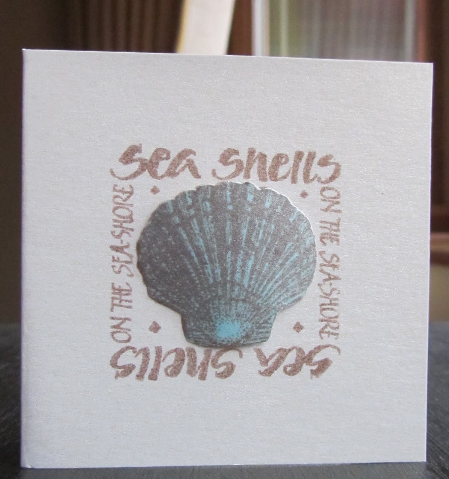
I see sea shells ....

.. on the sea shore.  Just a quick post this morning with a little card for this month's St Luke's Charity Card Challenge. 


Our theme this month is to make a card with a "seaside feeling".  My card is a tiny 3"×3" pearlised card.  I've used the sea shell stamp that came free with Craft Stamper some while ago.


I stamped the image directly onto the card - using my stamp-a-ma-jig to get the positioning correct.  Then I stamped it again onto a scrap bit of card and coloured the image with my promarkers.  Clean, simple and quick. 

Stamp:  Sea Shell - free with Craft Stamper
Ink:  Memento - Rich Cocoa
Promarker: Cool Aqua

There's still plenty of time to enter and we have a prize for the winner of this month's challenge - a £10 voucher for Quixotic Paperie.  Don't forget you can send your card and an envelope to St Luke's - check out the blog for full details.

I can't believe it's Friday already - the week has gone by so quickly.  Jonathan is out at a photo shoot today and I'm going to spend the morning in my craft room - I'm still trying to come up with something for this week's Waltzingmouse Sketch Challenge!  And then I suppose I'd better make a start on the ironing.  I'll be back later.  Have a good day.

Thursday, 11 August 2011

Movies, take 2 and a revamp .....

.... well, the weather wasn't great again today, so Jonathan and I headed off to the cinema for a second Film Fest.  We saw "Rise of the Planet of the Apes".  We'd seen some of the reviews of this movie - all good - so we were really keen to see it.  And we weren't disappointed.  Andy Serkis stars as the ape, Caesar, and he's brilliant.  The CGI effects are superb and the ape is "real"!  The film also stars James Franco as the scientist Will Rodman, who is trying to develop a drug to cure Alzheimer's Disease - the disease that Charles Rodman (brilliantly played by John Lithgow) has.  Testing takes place on apes - and the rest is the film!!  I'm not going to give any more of the story away.  It's excellent, we thoroughly enjoyed the film.  What was really nice is that the film provides a possible reason why there is a Planet of the Apes -  and I remember the first time I saw the original film and the shock at the end which was amazing.  It is still one of the best endings to a movie.  Well worth a visit.

After that we went to watch "Captain America"!!!  A really good romp.  Set in the second world war period, Steve Rogers tries to enlist but is turned down as unfit.  He eventually gets selected to join the Army but to a special unit, where he undergoes an experiment and becomes Captain America - a super hero.  It was fabulous fun - the kids will love it.  It's a 12A, so if you've got young ones, you might have to be careful, but the older kids will have a great time.

And now to some crafting.  I've been very busy in my craft room - but you'll have to wait until Sunday to see one of the cards - CR84FN - it's lovely!!!  I've done some remedial work on a couple of cards that I made last month. 

The first one I made for the Waltzingmouse Blog Waltz last month - the theme was birthday party. I had been asked to make a card for a friend who liked coffee! So I made four! Unfortunately the green one - which was also for WMSC56 - was entirely successful. So I've had another go. I've used the same sentiment, but this time I've skipped the black border - I think it's much better.


This was the orginal version - the black around the sentiment was not a good look!


The other card that I've "fixed" is one that I made for the Less is More blues challenge.  I stamped a random pattern with Stampin' Up! Circle Circus - but I couldn't get it to work as a single layer card.  So I've had another go and I'm rather pleased with it this time.


I mounted the original card onto some embossed silver card and then mounted all that onto a dark navy card base.  In my stash I have some birthday greeting toppers from a kit by Dawn Bibby that I got from QVC years ago.  I've not used many of them.  But the blue of the card is the same colour as one of the blues on the card - so I thought it would make a perfect topper.  I've mounted that onto layers of silver and navy.  A simple and elegant card - which I think I might send to my Dad.

That's all for now.  I'm off downstairs for a nice cup of coffee and catch up on some TV.  See you guys tomorrow.

Related Posts Plugin for WordPress, Blogger...